Designed to Disappoint: The power of a MHP (Minimum Hateable Product)
I never thought I’d advocate for creating something I hated. As a designer, my career has been built on crafting beautiful, intuitive experiences. But there I was, watching a potential customer struggle through a digital obstacle course that would make even the most patient user want to tear their hair out. This digital train wreck could become our greatest asset.
The interface was clunky, the flow unintuitive. Each click seemed to lead to a new frustration. My designer’s instincts screamed to fix it, to polish it, to make it shine. But a new reality was setting in: we needed to move forward, imperfections and all.
If you aren’t embarrassed by the first version of your product, you shipped too late. — Reid Hoffman
Enter the Minimum Hateable Product (MHP).
You’ve heard of MVP - Minimum Viable Product, the startup world’s favorite way to test markets with bare-bones functionality. MHP is MVP’s embarrassing cousin, the one we don’t invite to family gatherings.
MHP is the product that makes you cringe. It’s functional, sure, but only in the most basic sense. Imagine a website held together by virtual duct tape and a prayer – that’s our MHP. And yet, it might just be the key to rapid innovation in established industries like banking.
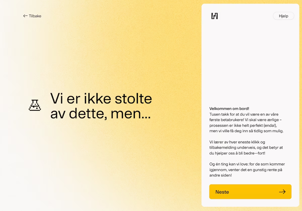
When we started at Heder Bank, we faced a choice: spend a year building the “perfect” banking system, or get something - anything - out the door in two months. We chose speed over perfection, progress over polish.
Our mortgage application process became a Frankenstein’s monster of disconnected parts. Credit checks on one url, anti money laundering in a mail later on. Customers bounced between URLs like pinballs, filling out forms that seemed to multiply like rabbits. Behind the scenes, our case workers performed digital acrobatics, juggling systems and manually connecting dots.
As a designer, every fiber of my being rebelled. This violated every best practice and committed war crimes against user experience. But as we watched our first mortgage payment go out, just 80 days after starting, it all made sense: Each customer’s struggle through our imperfect system taught us more than months of hypothetical planning and testing ever could. The product was rough, but it worked - and it gave us something invaluable: real customers with real feedback. We’re still improving, but we’re moving faster than we ever could have with a polished-but-delayed launch.
